Everyone you know, their mom and even their dog was there when Taylor Swift announced her 12th studio album, The Life of a Showgirl, on the New Heights podcast alongside her now-fiance Travis Kelce. I don’t even need to paint the picture; chances are you’re at least one of the 22 million views on that viral episode. Ever since the final curtains closed on the Eras Tour — the most successful world tour in music history — the planet has been on the edge of its seat in anticipation for what the monster on the hill would present next.
I will never forget my knee-jerk dismay from the moment I laid eyes on this album cover.
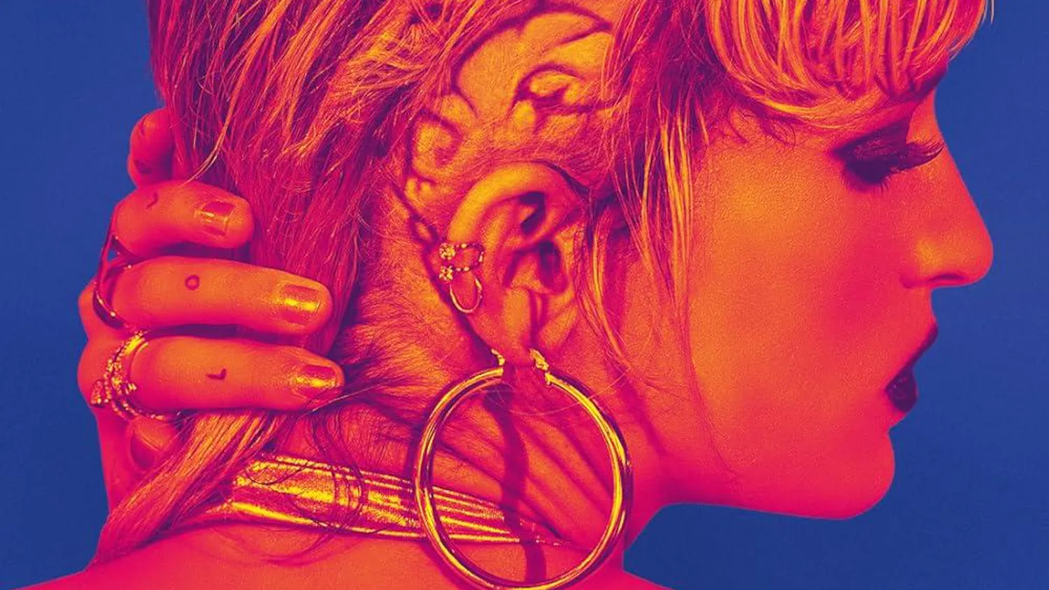
Let me preface this by acknowledging that the music isn’t even out yet, so this artistic interpretation currently exists in a vacuum as I analyze the visual body of work without the sonic context. In fact, let me actually start with something I love about this rollout before I make the first incision: the return of Mert Alaş and Marcus Piggott. The Taylor Swift cinematic universe would not have been so illustrated if not for the dragons she was forced to duel against since the dawn of her career. Every well-written underdog needs a powerful antagonist, and in Swift’s case that was a two-headed snake known as Kanye West and Kim Kardashian. Seeing Swift’s sharp features on this cover recalls a villainous wile; the corruption of America’s sweetheart in response to what fans now call “Snake Gate” around the Reputation era was arguably the most integral character study in shaping her narrative journey. Neither the second-act low point of Folklore, nor the climactic triumph of Midnights would have amassed such intense critical and commercial acclaim if not for the events of Reputation. Thus, it is poetic to see the photographers responsible for the visual identity of that album credited for the photoshoot of The Life of a Showgirl, which is somewhat expected to be the pop star’s magnum opus.
The photo itself flew in from gag city, but it's a shame the true art is still on the tarmac. Whenever I voice this distaste, people always swoop in to defend the cover, rambling about how ‘actually the image is a direct reference to the painting Ophelia by Sir John Everett Millais, and doesn’t that make it a literary mastermind product?’ Well, no. The concept is but one artistic component — and I quite like that one — but could the execution not have been just as calculated? If you're having the time of your life as a human mirrorball with an upcoming bulletproof album, why choose to be portrayed as though you’re still drowning? And if you are in fact struggling behind the curtain, why does the image still demand that you serve a face card? The visual language feels confused and contradictory to the plot.
Additionally, the scrapbook manipulations give me a strange feeling. Parts of the original photo are removed only to be awkwardly placed back a few centimeters away, and holistically there is supposed to be a shattered-glass effect, but glass does not shatter in geometrically-perfect rectangles! The text is strewn onto the cover in such a way that the viewer’s eye is guided to scribble its gaze across the image without being drawn to any particular focal point. Haphazard design can work, but only when it’s done with intention. Here, it just feels sloppy.
Some of the alternate images from the photoshoot are fair at a passing glance to the common consumer, but few individually deserve to be posted in the town square to represent the work. Part of the problem is the very release of these variant images in the first place — “It’s Frightening”, “It’s Rapturous”, “It’s Beautiful”, etc. Modern-day artists, especially in the pop genre, are in the midst of normalizing the release of vinyl collections with nearly ten different variants meant to represent the project just as much as the official cover. If you highlight everything, you highlight nothing; this abuse of capitalism dilutes the visual identity of the work, keeping artists from committing to a single, inspired piece. “The Shiny Bug” variant has the least appealing color palette I’ve ever seen on a Taylor Swift product since the Lover era. If I had the opportunity to edit this marketing campaign rollout, the album cover would have been the untitled, textless third picture in the carousel of her current pinned Instagram post. The feathery puffs, the black wig, the knowing slouch, the drink in hand. Simple, yet iconic.
I do understand what Taylor Swift was going for with the bathtub option — a reference to everything going on behind the scenes after each three-hour performance, the scent of sweat and perfume mixed perfectly in the air. Despite this, I am disappointed by the work of her editing crew and very much disappointed that the Mert and Marcus duo have to be associated with it. I do, however, have intense faith in the songs and stories to be discovered on this album which, at the end of the day, is the most important part. These incoming products from the business of human emotion will surely be the next world-stop moment I’ve yearned for in the big 2025. I could metabolize and criticize Swift’s decisions all I want, but hey, who’s the billionaire?
Marc Staiano is a junior in the College of Arts and Sciences. He can be reached at mcs382@cornell.edu.
Marc Staiano is a member of the Class of 2027 in the College of Arts and Sciences. He is an assistant Arts & Culture editor on the 144th Editorial Board and can be reached at mstaiano@cornellsun.com.


